Feature Spotlight: Reports & Dashboards

BY ALLISON LASLEY
Practifi
Unlock actionable insights with reports and dashboards
Whether you’re an advisor who wants to track your personal performance or a manager who needs to oversee team performance, Practifi’s enterprise-grade reports and dashboards make it easy to unlock powerful insights across your firm and help you make more informed business decisions.
Put your data to work with reports
While the first step of setting up your business management platform may be capturing data, the second most important step is putting that data to work.
By using Practifi as the hub of your advisory firm, multiple teams interact with the system and input information daily. This means you have a treasure trove of data spread across a range of business activities just waiting to be engaged. All you need are reports to align and surface this data in meaningful ways.
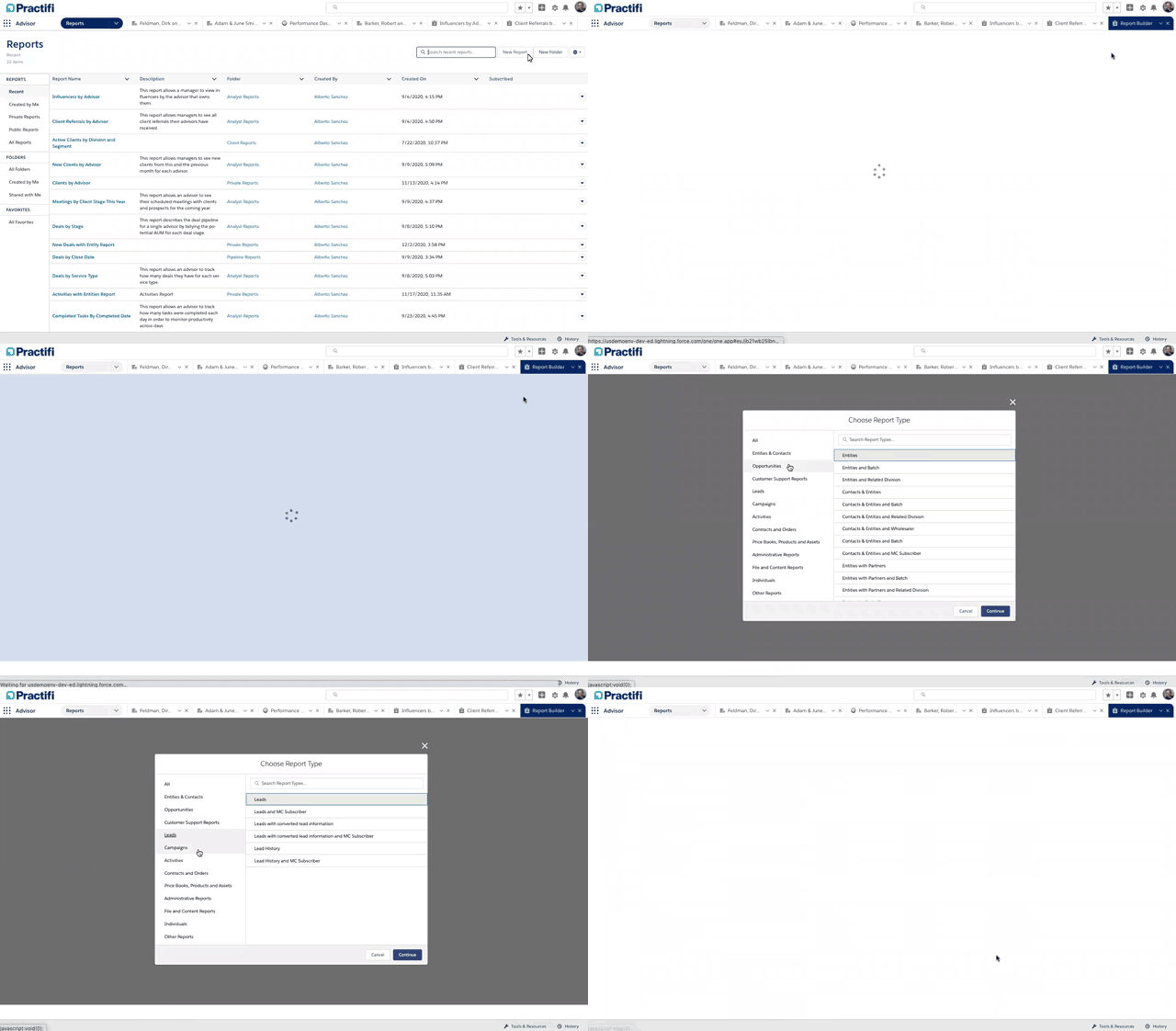
With a large range of various pre-built reports included in a standard subscription, your advisory teams can easily gain insights to help them grow their pipeline, improve productivity and increase referrals. When it comes to custom analytics, Practifi’s report builder gives you the freedom to create unlimited reports and provides plenty of options to filter, sort and visualize data so you can draw actionable insights from across the business.
Pre-built reports available
- Assets With Missing RMD Target
- Attributed Campaign ROI by Service Type
- Attributed Campaign ROI by Type Last 12 Months
- Clients by State
- Clients Due Annual Reviews
- Client Referrals by Advisor
- Clients Retiring in Next 90 Days
- Clients with Missing Information
- Completed Tasks by Advisor
- Completed Tasks by Completed Date
- Deals by Service Type
- Deals by Stage
- Deals by State
- Entities by State, Fulfull. % by Division
- Owner & Type YTD
- Fulfillment % by Owner YTD
- Fulfillment % by Service Type & AUM YTD
- Influencers by Advisor
- Influencers by Segment
- Lost Deals by Client Stage
- Meetings by Advisor
- Mettings by Client Stage this Year
- Missed RMDs LY by Advisor & Segment
- My Entities Report
- My Mailing Lists
- My Missed Deliverables by Client YTD
- New Clients by Advisor
- Open Deals by Close Date
- Outstanding RMDS TY by Advisor & Segment
- Prim Campaign ROI by Service Type Last 12
- Prim Campaign ROI by Type Last 12 Months
- Profit by Advisor and Segment
- Prospects Retiring in the Next 90 Days
- Referrals by Referrer
- Referrals by Source
- RMDs Beginning TY by Advisor & Segment
- Suspicious Emails Last 60 Days
- Task and Events Report
Visualize your data with charts and graphs
Once your report is created, the next step is to display the data in a way that makes sense to you and your stakeholders.
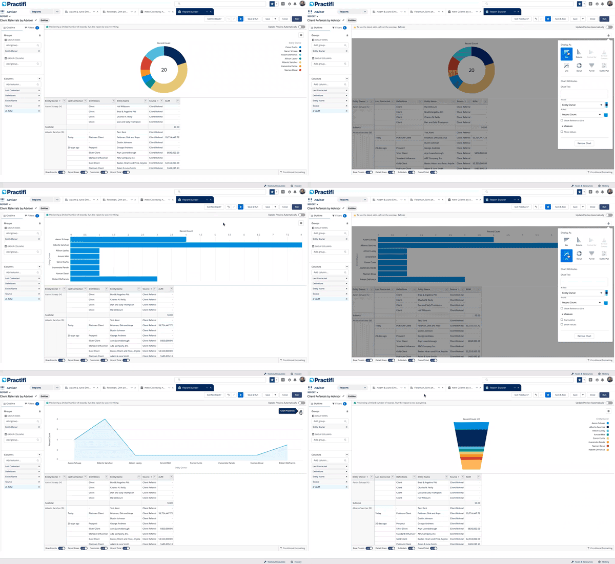
If you create a report but the insights aren’t easy to understand, the time and effort put into building the report will go to waste. Using charts and graphs can help. Visually displaying complex data allows stakeholders to understand and absorb insights quickly. When building reports in Practifi, you can choose from a variety of visuals to display your data.
We recommend using bar, column and line charts when you want to compare two or more values over a defined period of time, such as number of referrals per team member in a given quarter. If you want to dig into a certain data category and show the proportion breakdown, donut charts (similar to pie charts) are your best bet. Lastly, we recommend using funnel charts to help you visualize a linear progress where multiple steps are involved, such as pipeline progression.
Easily flip between bar, column, line, donut and funnel options to test which visual clearly illustrates your data in an accurate, yet impactful way. If you would like assistance choosing the right visual to display your data in an impactful way, your CSM will be happy to help.
Bring it all together with dashboards
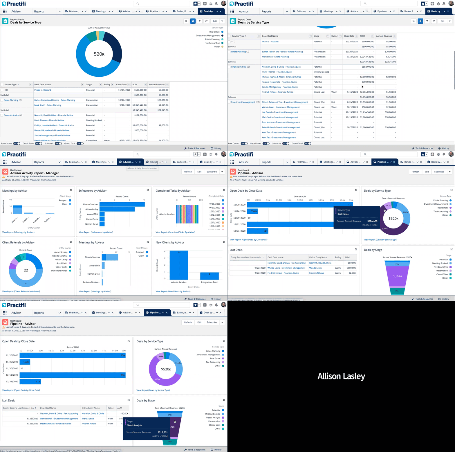
Once you have a few reports that display data in an impactful way, you’re ready to build your first dashboard. By selecting related reports, you and your team will be able to easily monitor performance across multiple activities. Not only do dashboards provide a comprehensive view on how a specific business area is performing, but they also help you make more informed business decisions.
In addition to the three pre-built dashboards that come with a standard subscription, Practifi’s dashboard builder gives you the freedom to customize your view with other reports. Once completed, you can share dashboards with your manager, team and stakeholders so everyone can gain value from seeing your firm’s data visualized.
Pre-built dashboards with Practifi subscription
- Activities Report – Advisor
Advisor Activity Report – Manager
- Pipeline – Advisor
Many advisory firms have valuable data locked away in separate systems but can’t report on it or surface it in impactful ways. With Practifi’s report and dashboard capabilities, you have everything you need to unlock powerful insights across your firm and make more informed business decisions.
Interested in learning more?
If you’re interested in learning how to make the most of these new features, please reach out to your Client Success Manager.
And if you’re interested in learning more about how Practifi’s reports and dashboards could benefit your firm, contact us today.
Get the latest insights delivered straight to you inbox.
